Read the responses to this week’s Write to Win prompt, and choose the answer you like most using this form.
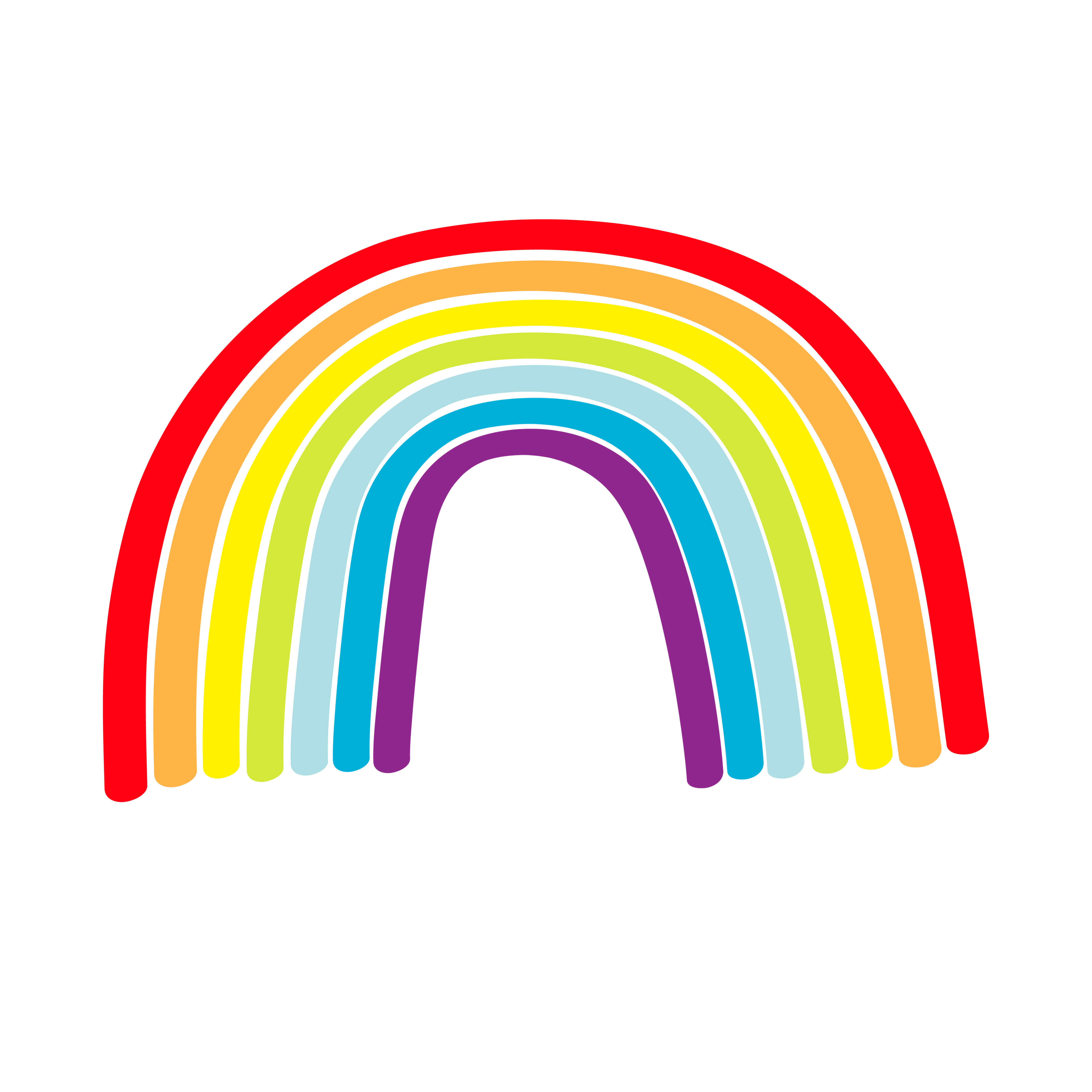
Cancer: If you stripped away the green colour from the rainbow, I would always be reminded of what I had lost. Green is everywhere – woven into the trees, spread across the grass and pulsing through life itself. Everyone else would be soaking in nature’s vitality, while I’d be stuck staring at a duller world – forever green with envy. Many colours are born from the primary shades, but without that hint of green, the rainbow feels less alive and less whole. Maybe that missing shade would nudge me to pause, breathe and truly appreciate the “greens” I do get to see.
Aries: I would choose to no longer see violet. While violet is part of some beautiful scenes – like lavender flowers swaying gently in the breeze – it represents only a small slice of the visible spectrum. Our eyes often perceive violet as a shade of blue or purple. Its absence would, therefore, be the least disruptive to my overall perception of the world. In contrast, losing some primary colours, like red or blue, would have a more significant impact on my ability to distinguish between different objects and environments.
Taurus: I’d choose to remove orange. Readers, look around you. How many things around you are orange? Clearly, orange isn’t used much in our lives, and it is also rarely seen in clothing stores for a reason. Its high-saturation tones are so bright and flashy to the point that its presence borders on attention-seeking, while its more muted shades are used as dull building exteriors. It’s unappealing and artificial, and for the little purpose it serves, there are simply better alternatives. Orange may momentarily catch the eye, but we tend to favour things that prove their worth over time, not just in the moment.
Leo: If I had to eliminate one colour from the rainbow, I would choose orange without hesitation. Unlike red, which can be dangerous as it sears your eyes like a fiery dragon’s breath, or yellow, which glows warmly and simply like an affectionate hug from sunshine, orange just awkwardly lingers in between. It’s embarrassingly unnecessary since it was a combination of two primary colours. Without it, the rainbow would flow smoothly from a spicy red to an optimistic yellow, skipping the clumsy orange. Life would feel more streamlined without this odd colour.
Libra: If I had to choose one colour from the rainbow to no longer be able to see, I would choose violet. This is because violet has the smallest presence compared to other colours in nature, and if it disappeared, I would not notice such a big difference in the world. I do not want any colour removed from the rainbow. But even if violet cannot be seen, at least this would preserve most colours, and the world could still look beautiful.
Capricorn: I would erase orange. This colour is just a mix of red and yellow, making it the most redundant colour, and thus, it is not really needed! I am sure we can all agree that the rainbow would still look pretty and natural without orange, as it is not as crucial as red, blue or violet – all colours that would make the rainbow look strange if they were erased. Orange is not only derivative in hue, but also a mix of its sister colours’ positive values, making it less significant. I am sorry, orange – you’re just not really needed.
Scorpio: If I had to choose one colour to never see again, I’d reluctantly pick orange. It is warm and vibrant, but in my eyes, it is merely a blend of red and yellow. Red is the fiery colour of passion, and yellow bursts with energy and light, while orange just sits somewhere in the middle. Losing orange wouldn’t drastically affect sunsets or the views in autumn since they are mainly composed of red and yellow. Removing orange is definitely a sacrifice, but the rainbow would remain mostly intact with a diverse spectrum of colours.
Sagittarius: It’s a hard choice, but I would choose yellow. Yes, yellow is vibrant and energetic, but in my opinion, it is the most boring colour. In the colour spectrum, I would classify yellow as the least warm colour compared with red and orange, but it is also not a cool colour. It does not harbour the passion of red, the calmness of blue, the mystique of purple or the liveliness of green. Moreover, yellow is often used in advertisements to draw the audience’s focus, but the overuse of yellow in every advertisement nowadays causes eye strain. It no longer induces energy but drains us of it.